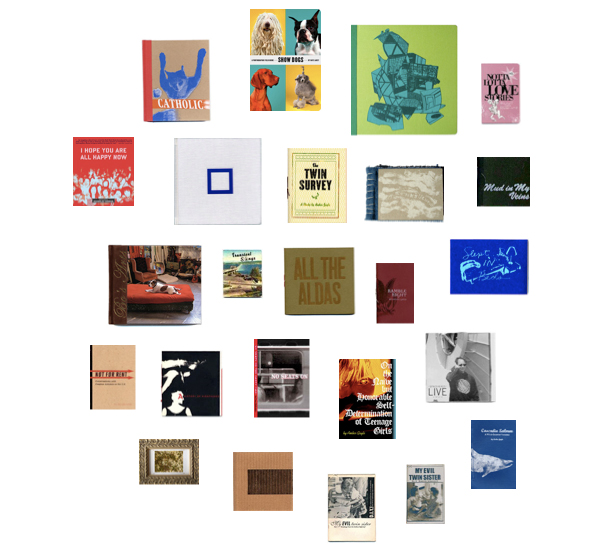
Evil Twin Publications and the book and record design work of Stacy Wakefield Forte.
Showing posts with label books. Show all posts
Wednesday, February 10
Monday, October 26
Wednesday, October 21
Houseplants
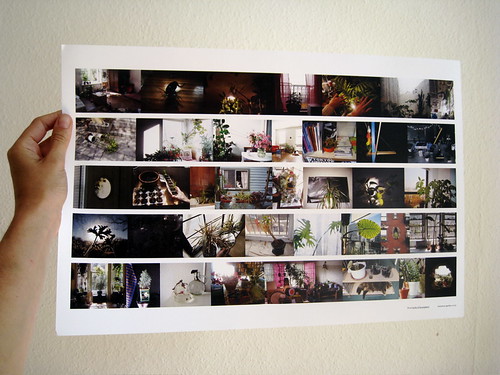
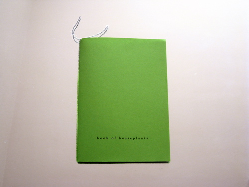
Guess I have a soft spot for independently published pictures of houseplants. This book and poster from MINIATUREGARDEN.
Thursday, October 8
Tuesday, October 6
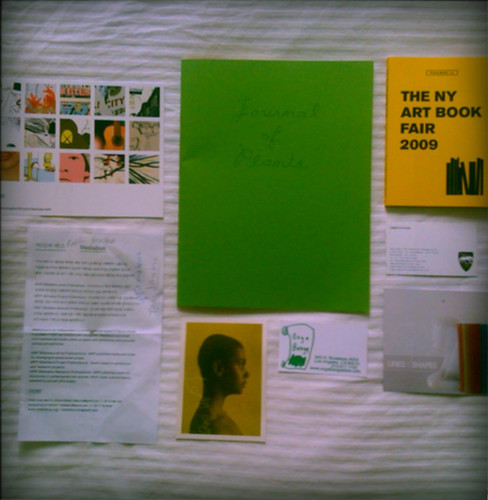
More from PS 1/NYABF/last Fri
A few things of note:
- We liked the Lines & Shapes table a lot
- Leandro Erlich's Swimming Pool - a must-see installation
- Rose in Williamsburg has gorgeous wallpaper and great cocktails
Monday, October 5
A healthy dose of inspiration
For a first-timer, the NY Art Book Fair was incredible--truly incredible. There were big-name booksellers present, but I of course found myself gravitated towards the smaller, independent tables. I couldn't get over how thousands of publications displayed on those tables were all little gems of art.
I wish I could have given my full attention to each and every table, but the sheer number of participants spread throughout the entire building of PS 1 made this impossible. Nonetheless, there is something for everyone no matter how long or short you attend. In my short time there these are the small publishers and artists that caught my eye, which I will attempt to collect from throughout the year:
Thursday, September 17
Huts for Woodbutchers and Trolls
Artist/Bookseller Matt Borruso on collecting architecture and counterculture books for their cover imagery:
"I am interested in the attempts and failures of many radical ideologies. The failure of the 60's/ 70's counterculture, the commodification of punk rock, the embrace of the dystopian over the utopian dream ... these are all well known. In these books though I find the beauty of small success, the DIY spirit, the dismissal of a dominant world. I am also interested in the aesthetics of these ideologies and their tenacious ability to outlast the movements themselves. The images and style of once radical subcultures are hollowed out, resurrected, and resold as something new. The look of these structures and the ideologies that surrounded their construction and habitation have now become mainstream. We currently consume the aesthetic of this failed moment in history as 'green' fashion and lifestyle. Ecological becomes Environmental. The Om symbol is stamped on an 'enlightenment' credit card available from Visa."
Thursday, December 4
Top to bottom:
Desktop wallpaper download from Kate Spade's behind the curtain, Summer 2007
Opening image on Coralie Bickford-Smith's interim website of books she's designed for Penguin
A few covers from The Pelican Project by things magazine
Sunday, July 20
Wednesday, October 17
Before it was exploited for hipster soft porn marketing schemes...
I was fascinated by this article about the font ITC Grouch in Design Observer from a couple months ago. I had been noticing a throwback to this font in the circles of American Apparel/Vice Magazine/Nylon/The Cobra Snake... whatever genre you want to call it that features (camera-flashed) skinny girls with unkempt hair and boys with mustaches and pot bellies. (I can't think of a better word for it than "hipster" but that word gets you into trouble these days, since its contexts are so polarizing now, that I have to think about who I am talking to before I actually use it.)
Anyway, before that article, I hadn't known what the font was a throwback of. But when I did have my encounters it always felt strangely familiar, like I had known it all my life. Not surprisingly, I had. The font was designed in the 1970's and was used regularly through the 70's and 80's. And much like the author, once it moved from my peripheral and into the bloodstream, I found it hard to get rid of. Here are my most recent acquisitions of ITC Grouch (or similar renditions):


Anyway, before that article, I hadn't known what the font was a throwback of. But when I did have my encounters it always felt strangely familiar, like I had known it all my life. Not surprisingly, I had. The font was designed in the 1970's and was used regularly through the 70's and 80's. And much like the author, once it moved from my peripheral and into the bloodstream, I found it hard to get rid of. Here are my most recent acquisitions of ITC Grouch (or similar renditions):
(This is the spine from one of the books I also got from Housing Works' Open Air Book Fair. It was published in 1971 and has amazing and extensive diagrams and illustrations on how to take care of indoor plants.)
(I found this Pantone binder of thousands of color swatches on the street. The cartoon on the right is a snippet from a brochure that came with the Pantone binder, which I just included because I thought it was funny.)
Monday, October 15
By the cover
These are from Housing Works Used Book Cafe's Open Air Book Fair in SoHo a couple weekends ago. $1 each, so they were more like purchases for design research based purely on their covers, though the Turabian writing manual, Othello and The Dud Avocado (apparently, the O.G. Bridget Jones of the 50's and just reissued) are classics. Yen helped me find a couple of these.

I love all the clean lines (especially the stripes), simple color palettes and no-nonsense typography. The writing manual is my favorite. Graphic designers were such pioneers back in the day. It's also no surprise that Constructivism is one of my favorite art movements.
Subscribe to:
Posts (Atom)