
Anyway, before that article, I hadn't known what the font was a throwback of. But when I did have my encounters it always felt strangely familiar, like I had known it all my life. Not surprisingly, I had. The font was designed in the 1970's and was used regularly through the 70's and 80's. And much like the author, once it moved from my peripheral and into the bloodstream, I found it hard to get rid of. Here are my most recent acquisitions of ITC Grouch (or similar renditions):

(This is the spine from one of the books I also got from Housing Works' Open Air Book Fair. It was published in 1971 and has amazing and extensive diagrams and illustrations on how to take care of indoor plants.)
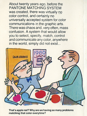
(I found this Pantone binder of thousands of color swatches on the street. The cartoon on the right is a snippet from a brochure that came with the Pantone binder, which I just included because I thought it was funny.)

No comments:
Post a Comment